7 Tips for a good call-to-action (CTA) in your online display banner
 Whatever the purpose of your online advertising campaign is, ultimately there is only one parameter that determines the success of your online banner campaign: the number of clicks! The chance of that click happening is much more likely if you use a good call-to-action (CTA). With the tips in this article we will help you to create a winning call to action.
The role of the call-to-action
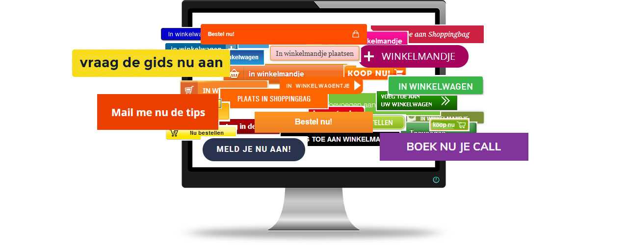
The main reason to use a call-to-action in an online banner is to encourage your prospect to take an action. What do you want from your potential customers? Where should they click and what is the promotion? Do you want them to buy something from you, subscribe to something, sign up for your event, try out a free product sample, request your e-book, schedule an appointment …? Whatever you want your prospects to do, make it clear. The perfect call-to-action button is clear and encourages action.
Tip 1 : Seduce the customer in small steps
Think in small steps. Of course you should keep your final goal in mind. But don’t forget that (online) customers like to be taken by the hand and guided in their purchase. Don’t scare them with an aggressive „buy now“ button. Better to divide the sales process into small parts. People are more likely to click on your CTA button when they can request a free sample, request a catalog or get something on view for 3 weeks than when you aggressively jump on them with your „buy now“ button. If you use a low-threshold call-to-action, the chances that you will successfully guide them towards a purchase is greater than if you take too large steps and scare the customer.
Tip 2: Create a sense of urgency
Sometimes people need a little push to click on an online advertisement. Creating a sense of urgency can be such a push. With the emphasis on ‚can be‘ because it only works if you include a temporary component in your offer. For example, think of:
- Special discount promotions (only today with a 25 % discount)
- Temporary changes to your product (special versions with limited availability)
- Promotions (exclusively for members of …)
You can translate this into a catchy call-to-action such as:
- Sign in and get 50% off – only today!
- Register NOW for this great event
Extra tip: Use a countdown clock in your ad. Big chance that this will result in more clicks!
Tip 3: Make your button stand out
Our brains work in a strange way. For example, we tend to notice differences in our environment quickly. If your call-to-action deviates from the rest of the banner, your brain will quickly notice this and pay attention to it. So make sure your CTA button is different from the rest of your banner, so that it stands out.
Ways to create a distinctive CTA button can be:
– Use a clear contrasting color (orange or green work well, rather not gray)
– Make sure that something happens when hovering, such as a different color, a movement, etc.
– Add a 3D effect
– Use enough empty space around the button
– Use graphic elements to direct attention to the button. For example, draw an arrow in the direction of the CTA button.

Tip 4: Use a catchy button text
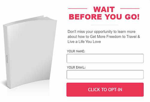
Text can have a magical effect on people. With the right combination of words you can achieve incredible things! Sometimes you can make or break a conversion by adding one word. With the right text you can therefore encourage people to take action. Many people think that a call-to-action button only may consist of maximally 3 words. Dont’t worry. No need to hold yourself back. As long as the text encourages action, everything is fine. An important condition for a good button text is that the answer to the question „I want …“ is included. A text like „register to learn more about … “ is not very attractive. Nobody wants to register. People do want to „Learn more about …“ . Use that instead if you want people to click.
Below is a good example of an uninspiring CTA text. The text „Click to opt-in‘ does not trigger an ‚I want to‘ sensation…
Tip 5: Write towards the person
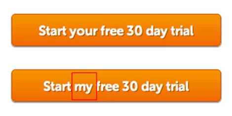
Not only the answer to the „I-want“ question is important. It appears that writing to the person has a positive effect on the click behavior. The text „Start your free trial period“ appears to convert worse than the text „Start my free trial period“. Instead of using „Book your tickets“ try „Book my tickets“ or change „Find your holidays“ into „Find my holidays“.
Tip 6: Play with click triggers
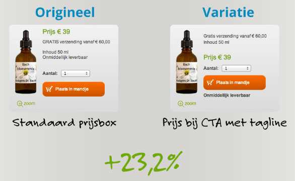
Adding an extra text line below the button often leads to more clicks. This extra line of text is called a ‚click trigger‘. Texts that remove risks work best. Click triggers can be:
– testimonials : „If I had known this I would have started it 10 years earlier“
– information that eliminates risks and fears, such as „no bank details required“ or „on average our users see an increase in profits of 40% when using ..“
– important advantages: „ordered before 23:00, delivered tomorrow“ or „not good, money back“
– data: join more than 1,000 men who have preceded you
AG consult dis a research for Bach Bloesemmix and tested a CTA with and without click trigger. The version with click trigger resulted in 23,2% more conversion! Try it yourself, it will work!
Tip 7: Arouse the curiosity
As mentioned before: it’s all about the click. Your job is to give your potential customers a reason to click on your call-to-action button. Make them curious. If you use a discount promotion, only show the exact discount percentage or the price after the click. In this way you guide your potential customers to the landing page that you specially have created for your promotion. An environment to get them in the „yes-I-want“-mode. In case the potential customer is not ready to buy yet, no worries. Once he or she has been on your website, the next time it will be easier for him or her to find you because it’s a ‚known‘ environment that creates trust. This will pay back in the future.
More information?
With the above tips we have hopefully given you new ideas to test. Do you have any questions about creating online display banners or CTAs in display ads? Let us know! Call Lars on +31 (0) 168 476 144 or send us an e-mail.


